In case you haven't tried the new Promomash environment yet, that's what users are saying when they see it for the first time. And it IS completely different. It's been a long labor of love to create it for you. So, not only are we excited about finally unveiling it to you, we wanted to also share how and why our entirely new look and feel came into being.
(If you haven't seen the Version 3 platform yet, please check out our blog post from earlier this week, which has instructions for how to get early access.)
COLOR
 Probably the first thing you'll notice is a beautiful new color scheme. When you look at Version 2 next to Version 3, the differences are pretty obvious. When we set out to design the first version of Promomash, we wanted to make it clear what was ok (green) and what needed attention (red and orange). It was a good idea at the time! But of course, all good things must come to an end. And this is a great thing if what comes next is a big improvement!
Since we launched Version 2, the Promomash platform has become much more sophisticated, with many features being added, and a lot more information to present to the user. And with all that information, the Version 2 color scheme started to get, well, a bit busy. For Version 3, we wanted something sophisticated, yet easy on the eyes, and able to simplify the rich set of features that we currently have – as well as the other awesome features that are coming in the not-too-distant future.
With purple and turquoise as the main colors, Version 3 is soothing for the eye (and the soul). Here's why: Purple is neither a cool nor warm color, since it is a mix of blue (cool) and red (warm) and has a bit of the vibrational energy of both. Promomash purple has more blue which increases stability, yet maintains the assertivenes of red. Purple is known as the color of spirituality, and is generally felt to support meditation and a balance between the spiritual and material realms. Purple is the also known as a color of royalty, wealth, independence, creativity and wisdom.
 Our secondary color, turqoise is a color mixed from blue and green. It is uplifting and brings about serenity (as if looking into and ocean) and balance. It helps us to think more clearly and take a harmonious approach. These are all good things in the world of demos and events, right?
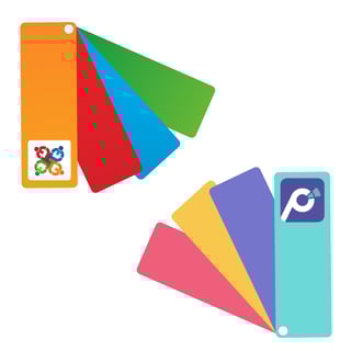
We chose the rest of the palette to work with the primary scheme to soothe and bring peace, clarity and creativity. We stayed within pastels and more desaturated hues to continue the harmony.
FONT

We chose our new font for its readibility. With the perfect combination of width and height, our designers found it is the least straining to the eye, making even long hours at work much more enjoyable and stress-free. We also tested the font for mobile devices, making sure it is easy to read with plenty of contrast.
BRANDING AND LOGO
You can most easily see the contrast between Version 2 and Version 3 by looking at our old and new logos side by side. What a difference!
Please be clear – we still LOVE our original logo. It features 4 people (representing ambassadors, managers, executives, brokers – even retailers or Promomash staff!) all meeting together and joining hands to do better work. It's a great encapsulation of some of the central ideas behind Promomash – cooperation, synergy, teamwork. But it also requires a bit of thought to figure out. And with all those shapes and color going on, we started joking that it looked a bit like a Christmas tree gone out of control.
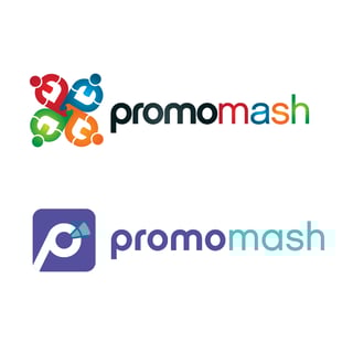 With Version 3, we set out to describe a next level of sophistication and simplicity. The “P” is tilted forward, suggesting the progressiveness of Promomash. And our core idea is now represented by a megaphone: Let’s get out there and get the word out! We are emphasizing this because as we add more and more features to Promomash, we are fulfilling our vision of being an all-encompassing platform that helps you promote better.
Finally, we wanted to maintain continuity with our past, so we retained the typeface of our original wordmark (i.e. the word “Promomash”) to highlight our loyalty and appreciation for what got us to this point.
LAYOUT
One of the most important design criteria for our new look and feel has been to leave as much “white space” as possible in every page of the new platform. This adds to the calm and clarity we began with our choice of colors. 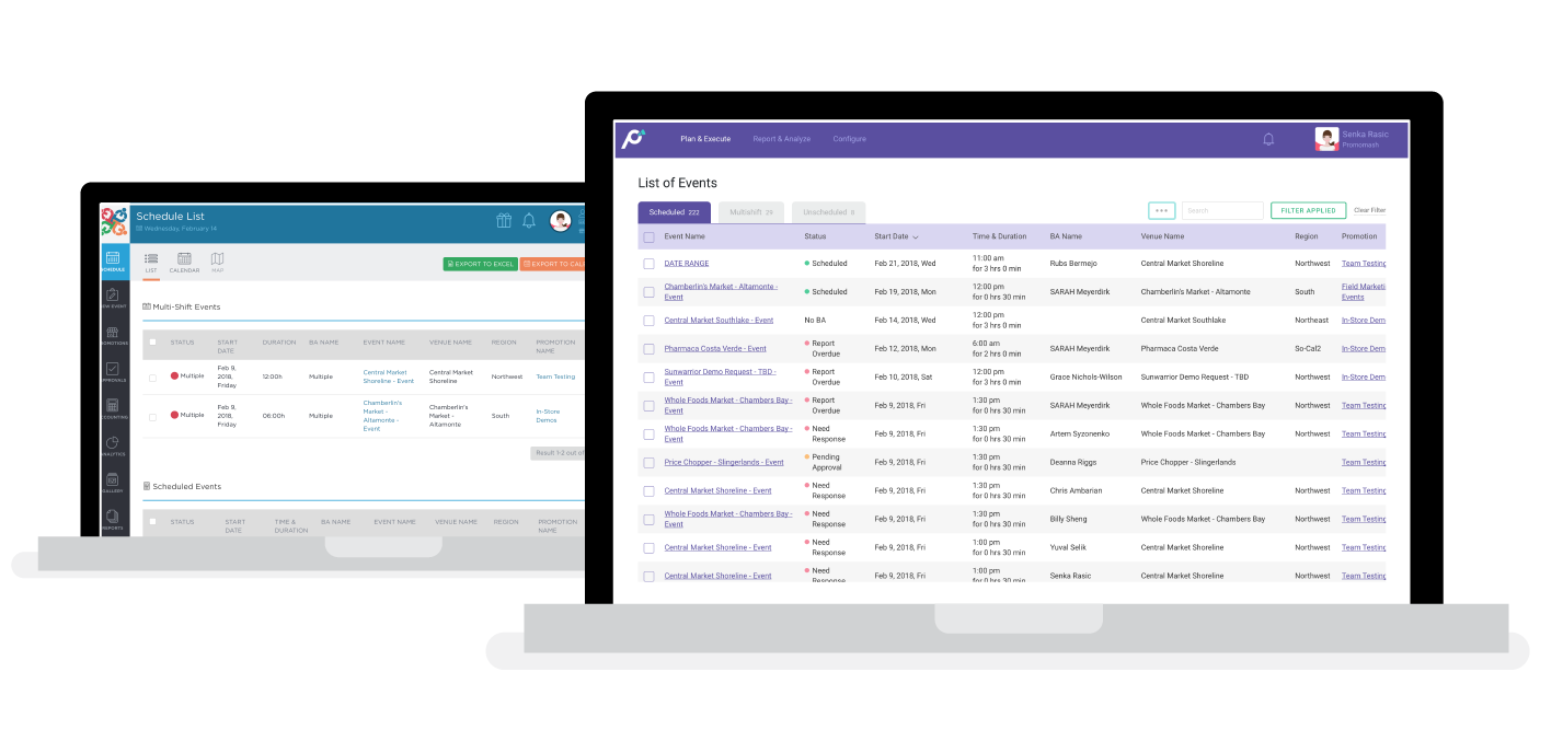
Next, we set out to arrange things to better reflect how our users work. And when you think about it, managers and ambassadors do work very differently. Our usage statistics show that managers almost always work on Promomash from a laptop or desktop computer, while BAs most often access Promomash from their mobile phones. So, to better serve each, we customized environments for each.
Managers will find that Version 3 is better organized, but most of the functions are very familiar. It should be super intuitive to any existing manager-users. After a few usage tips on the new menu structure, you’ll be quickly up to speed.
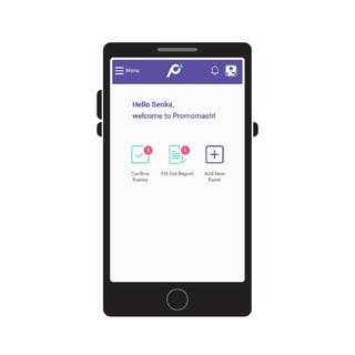
For BAs, however, the changes in Version 3 are much more pronounced. Based on the inputs (and yes, a couple of complaints) we’ve received from BAs in the last 2 years, we basically started with a clean slate and redesigned the entire BA experience around their smartphones. The new BA experience sets a new standard for mobile-friendly field marketing apps. We are anticipating that Promomash Version 3 will be life-changing for nearly every BA out there.
SUMMARY
There you have it: a bit of the context and thinking that went into making Promomash even better. We hope you love our new Version 3 design as much as we do, and we look forward to hearing your feedback at support@promomash.com.
Look for our next blog post on Friday, where we’ll discuss some of the great new features that you’ll find on the BM side of Version 3, along with training resources for your staff. Next week, we’ll cover the new BA (reporting) experience.
